
Almost ten years ago, nearly everybody who was accessing the web was on a desktop computer. In 2006, only two screen sizes were responsible for 77% of all internet usage.
This trend has completely changed. According to a research study conducted by Mobify, today, ten different screen sizes comprising tablets, smartphones, web-enabled TVs, netbooks, and laptops represent 77%t of total internet usage.
It is interesting to note that there is no single screen size that commands more than 20% of the market share. Nowadays, when marketers design their websites, they must consider different types of devices accessing the internet-from budget-friendly Android devices to smart TVs and high-end iMacs.
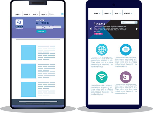
A responsive and user-friendly mobile design is the answer for a digital world where tablet and smartphone users demand an intuitive and feature-rich web experience that matches the one on desktop computers. However, implementing responsive mobile design is not the total answer. It may resolve the problem of screen-size layout, but there are other fundamental problems with the responsive strategy that many marketers ignore.
The following are some common mistakes that could impact your responsive mobile conversion:
1. Outsized, data-heavy images
Images represent a major responsive conversion problem. Since a responsive website utilizes one markup for various devices, it is crucial to make sure that only big and appealing images are loaded to Retina iPad displays. In contrast, older smartphones get fast-loading images that have a low resolution.
For websites with rich images, the problems start with mobile page speed because of the size of high-resolution images rendered to an inappropriate device. Wasting valuable bandwidth when sending images to the wrong devices is essentially like throwing money away.
Below are three methods for optimizing images for all resolutions and screen sizes:
- Resize images using imagemagick software to optimize their size.
- Utilize Lossy Compression to minimize the size of the image totally while at the same time retain depth.
- Use multiple servers to render images-ideally Amazon Cloudfront CDN.
By applying these hacks, you can increase your mobile conversion. This is because these hacks ensure that you can consistently convey the appropriate images to the right devices.
2. Poor page-loading times
Web pages with slow loading times face a big problem because slow-loading pages are annoying to users. An average retail mobile website in the US takes 6.9 seconds to load.
 However, according to a study conducted by Akamai, 40% of users will leave a web page that takes over three seconds to load. In addition,64% of online shoppers that are unhappy with their website will move to another site the next time they shop.
Web-users will leave your site if they are forced to wait for a long time in order to view your web page content. Jakob Nielsen, the author of a book called Usability Engineering, says that people can tolerate a maximum of 10 seconds loading time before they abandon a page. Even a delay of a couple of seconds is sufficient to create a bad experience for the user.
Leading companies recognize that the performance of their website is crucial, and appreciating their users’ time can make them have a competitive edge in the market. This approach constitutes a major plank of Google’s commercial ideology.
Facebook designers value the time of their users more than anything else. In addition, they understand that quicker experiences are more effective and feel more natural. Users should not notice the performance of the website.
3. Integrating long forms in your website
 Many people don’t like to fill out long forms, especially on mobile. Avoid incorporating long and tedious forms that force users to type in a lot of information. Long forms discourage your users and harm your conversion rates when used for any transaction form. For example, Expedia lost $12 million due to using an irrelevant form field that left their users confused.
On the other hand, HubSpot (A marketing automation solution) increased their conversion rates by 50% when they cut the number of form fields on their site from four to three. Shorter forms are always better on the web- especially on mobile devices.
4. Not paying attention to the user’s goal on your mobile site
Responsive design will not solve all problems. Although having a responsive design solves a lot of mobile user experience(UX) issues, it does not always consider the user’s goals. Smartinsights.com notes that there is a 270% difference between mobile and desktop conversion rates. This is because people do not understand mobile websites.
When it comes to desktop computers, having many words and long titles has an impact that is sometimes completely different from what happens on mobile devices. Additional text on a mobile device will obscure that page and discourage the user from attaining their goal- which is usually the call to action.
Apart from the menu bar, it would be best to concentrate on helping your users navigate through your webpage more easily, particularly the call-to-action buttons. As you are designing your website, keep the mobile user in mind and ensure that their journey across your website is much easier, focusing on your conversion rate.
Conclusion:
Usage of mobile media is rising faster than TV, desktop, print, and radio. Today, more people than ever are accessing the internet using mobile devices. It is therefore critical to design mobile websites that are easier and more comfortable to use. A website that is hard to navigate annoys mobile users- causing them to abandon your site and search for other sites.
If you fail to ensure that your website is mobile-friendly, visitors to your site will decline to fill your forms, ditch their shopping cart, abandon your site and conduct business with your competitors. Ultimately, this will hurt your conversion rate.
If you need any help redesigning your old site or creating a brand new website that will be compatible with all mobile devices, Let’s Talk!
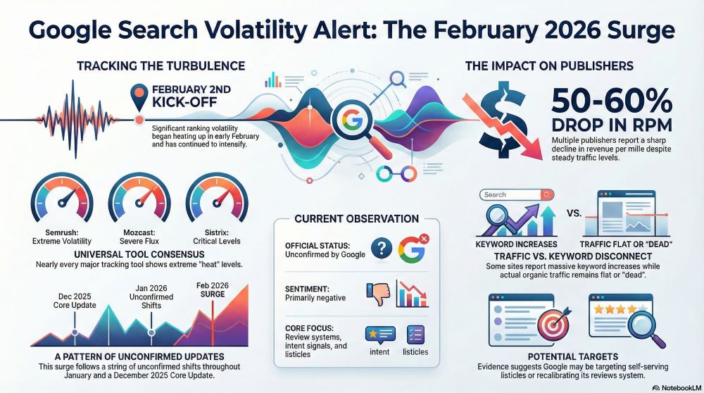
Google Search Ranking Volatility Heats Up — Extended Report (2026 Edition)
Google Search is showing unusually high ranking...

User Experience Is Still King: Core Web Vitals in 2025
In the ever-shifting world of SEO, few things...

What Modern Web Design Really Means in 2025
Why Looks Alone Aren’t Enough Anymore In the...